Case study · Burnley, Lancashire
Shaws Builders. A family firm, presented properly.
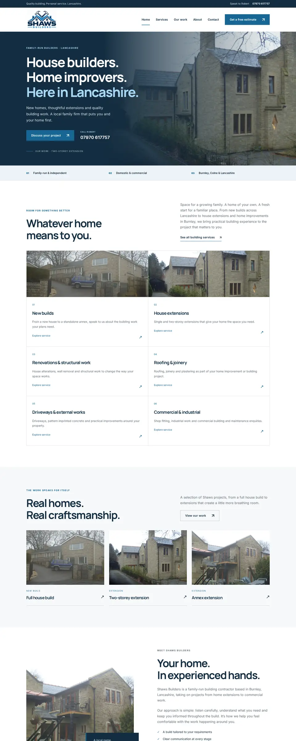
Shaws Builders’ website ran on an older WordPress theme with a desktop-only layout. The redesign preview leads with their own project photos and puts a call to Robert one tap away on any phone.
- Client
- Shaws Builders
- Location
- Burnley, Lancashire
- Sector
- Family-run builders
- Status
- Redesign preview · not yet launched
Before & after · desktop
The homepage, side by side.
Original site: shawsbuilders.co.uk. Redesign preview: shawsbuilders.co.uk/preview/. Both captured on 1 November 2026.
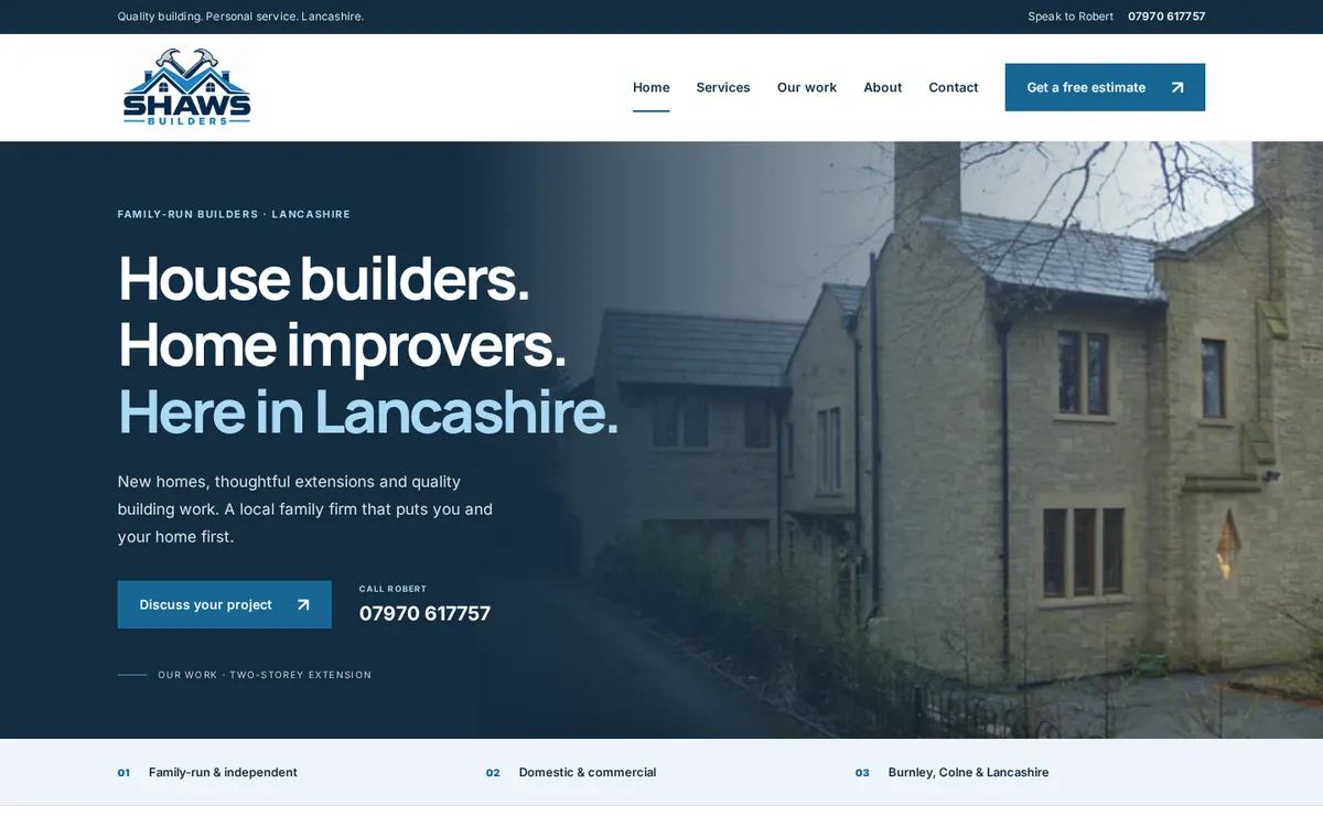
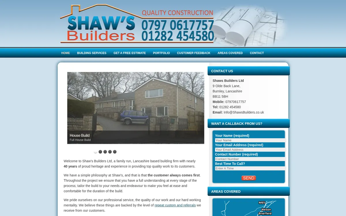 BeforeAfter · preview
Scroll the pages
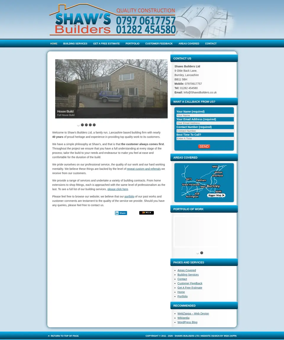
The full homepage, top to bottom.
Scroll inside each frame to see more of the page.
Before & after · mobile
Built for the phone in your customer’s hand.
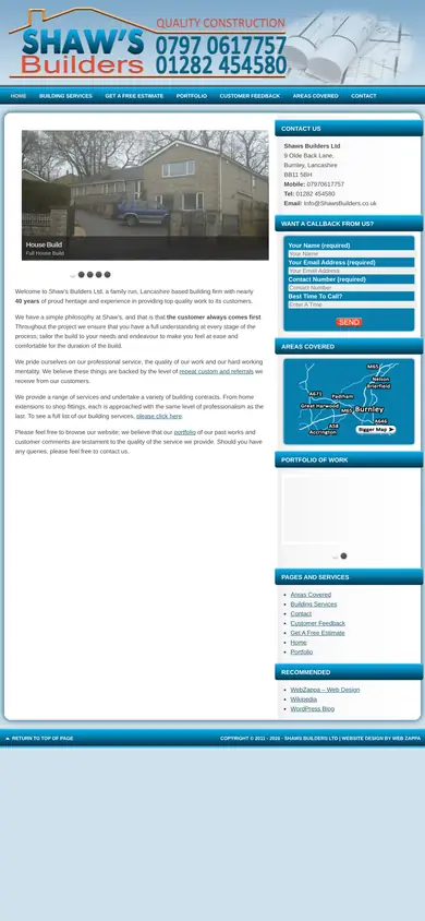
Most local customers will meet the business on a phone first. Scroll inside each phone to compare.

The starting point
What we saw on the original site.
- The original homepage uses a fixed desktop layout; on a phone it appears as a shrunken desktop page.
- Contact details sit in a busy sidebar alongside a callback form and a map graphic.
- The page structure and titles date from an older WordPress theme.
What changed
What the redesign preview does differently.
01
Photo-led design
A calmer, modern layout that lets Shaws’ own project photography do the talking.
02
One tap to Robert
The whole “Speak to Robert” strip is a single tap-to-call link, plus a two-way Call / Enquire bar on phones.
03
Same words, better layout
The hero headline and paragraph are kept word for word, with tighter spacing so content appears sooner on phones.
04
Accessible navigation
A tidier header and menu that closes after a tap, on an outside tap or with Escape.
05
Search foundations
Unique page titles and descriptions, natural local wording and accurate image descriptions.
06
Lighter files
The logo file was halved in size with no visible change.
Status & next steps
Where this project stands.
This is a redesign preview prepared for client review. It is not yet the live website, and no traffic, ranking or enquiry results are claimed.
- Robert to supply higher-resolution photos for some services
- Confirm which phone number is the main business number
- Agree launch plans before the preview replaces the current WordPress site
More of our work

Could your website use the same treatment?
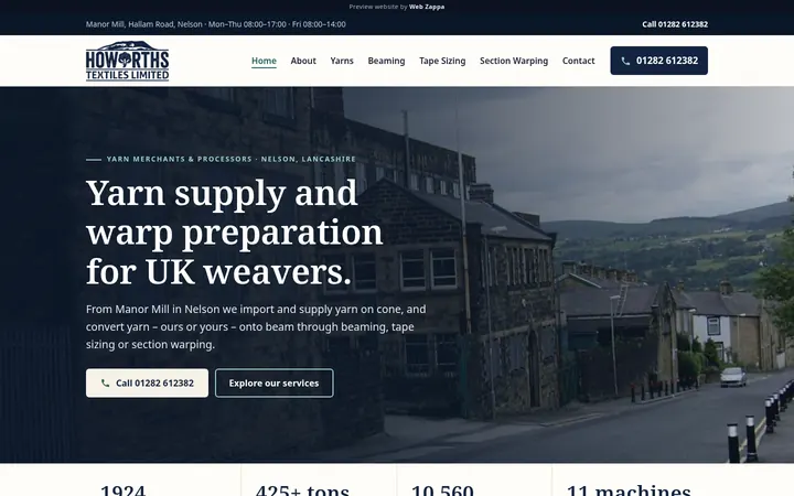
Tell me about your business and I’ll prepare a free, personalised homepage preview — no obligation to proceed.